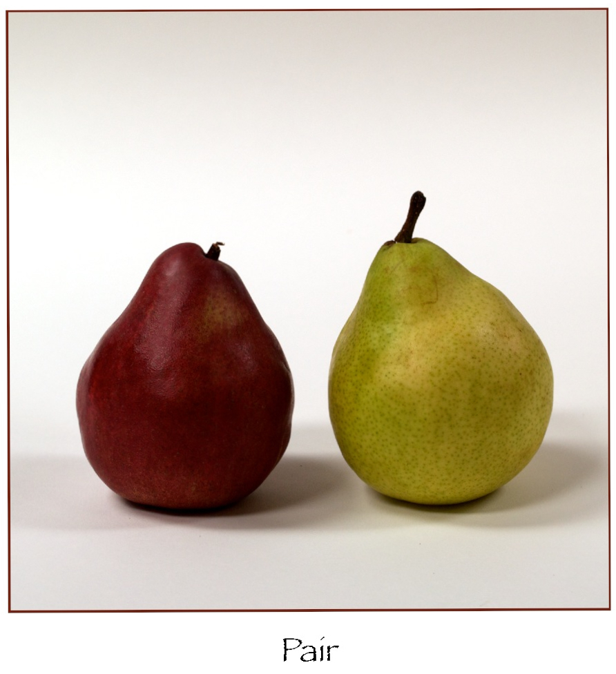
Category: About Images

  • Pear, Pair, Pare

    Pear, Pair, Pare

  • Patterns

    Patterns

    Waiting for the Ferry • Sorrento

    Waiting for a boat to Capri, I just had to take this photo. The pattern of the metal decking and her stockings matched. The limited color palette works to keep this image simple, and the triangular shapes of the water, dock, shadows, and shaded areas on her legs all work together. My friend Bill G. visited recently and commented on the art in my house, a combination of works by other photographers, artists, and a few of my own photos. Bill said that my work has always featured strong diagonal lines. Something I only became cognizant of in the last few years. Go figure!

  • My 1st Published Image!

    My 1st Published Image!

    It was a holiday weekend in the early 70s. It had been raining, and this tree fell on this poor Continental. I grabbed my camera and took a few photos. If memory serves right, my dad recommended calling the paper to see if they would be interested. Dad ended up taking me downtown to the old offices of The San Diego Union-Tribune. Their photo editor processed the film and picked this shot. It ran on Page 3 in The Union, the morning paper, which at the time was a page of photos. This image is a photo of the page in the paper. I even got paid, a whole $7.50! The rest is history.

    The Image as Published
  • Awards…

    Awards…

    When I moved to Fort Worth, TX, I joined the Fort Worth Camera Club. This photo won an award: “Color Print of the Year.” It surprised most of the people in that competition, including me. Most of my “personal” work is odd things that catch my eye; shapes, lines, colors, situations… I used a fine-point Sharpie to outline some of the details on this print. Doing that turned the image into something between an illustration and a photo. The same year, I also won “Studio Print of the Year” for an image of a candlestick phone, Polaroid Image Transfer. That was quite a year! I may post that image in the future.

  • Composition and Lines

    Composition and Lines

    Paying attention to where the lines in your viewfinder lead can improve your composition. Here, I’ve used the red lines to illustrate the subject relationship. The lines exist even if you are not aware of them when shooting. The purple arrow shows subject contact. The yellow lines show an interesting connection between secondary items in the photo. Lastly, the three green lines show the normal vanishing point of the environment. I could have added vertical lines for the columns, but those are pretty obvious and more environmental. I noticed several years ago when going through my Aperture library (I still limp along with that software for the majority of my cataloging and first round of image editing…) that the vast majority of my images feature strong diagonal lines. The Back Story: This was for a portfolio shoot. Martina was taking a break as I was waiting for the guy to pass when I noticed them both checking each other out. I grabbed this shot quickly. Not enough time to make it perfect, but a good image for what happened in the moment. Even though it was a quick shot, my composition worked nicely.

    Steve

  • My Fortune…

    My Fortune…

    Lighting Practice. A soft box from above the camera with a bit of fill from a reflector just under the camera.

    Tucson Product Photographer
    Fortune Cookies © Steven Lunetta Photography